Visual identity guidelines
This guideline is our single source of truth and the blueprint for how we communicate who we are to the world. In these guidelines, you will find the building blocks of our visual identity.
Whether you are designing and building a website, launching a marketing campaign, or putting together a sales presentation, these guidelines provide the tools and rules you need to build a consistent, powerful, and visually unified Severa brand experience.
Logo
The Severa logo is the main identifier of the brand. It combines both round shapes and sharp corners which merge into each other in a dynamic and forward-looking way. The formal language of the logo expresses active movement, flow. Please note, that logomark uses only solid colors.
Single color logo
Logo can be used only in Prussian Blue (on light backgrounds) or white (on dark backgrounds).


Logo versions
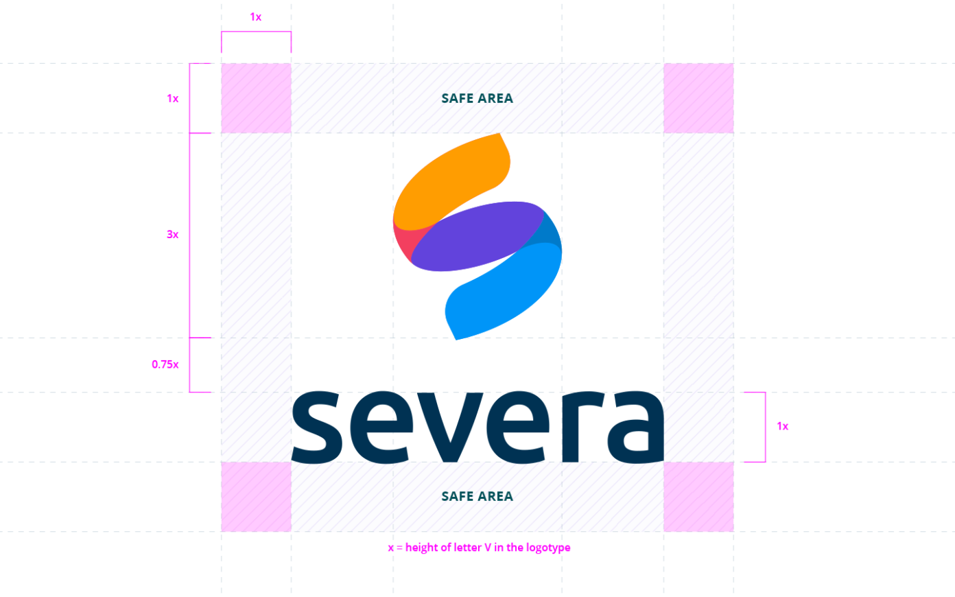
Vertical version of the logo can be used when primary version doesn’t fit your composition. Vertical version is also used in our video end-plates for vertical and square aspect ratios.
Severa by Visma logo
By Visma version of the logo is used only in specific use cases.
Placing the logo
As a rule of thumb, place the Severa logo to the top left, top right, lower left, or lower right of the canvas. The logo can be centered in narrow layouts, in a video or on a slide, but for the most part it shows up in a corner.
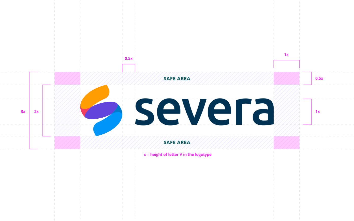
Safe area
This is the minimum space that should not contain any graphical element so the logo can stand out. Note that the logo is centered according to the logo mark, not the logotype.
Logo over imagery
When using full bleed image with logo on it, make sure the logo is placed in a relatively empty space, and make sure it stands out. (Full bleed is when the color extends to the edge of the image with no margin.)
Color
Colour is a key visual identifier for Severa, creating a consistent experience across everything from digital interfaces to marketing. Its role is to build instant recognition, direct attention, and support usability at every touchpoint. This section defines our brand palette and provides guidelines for its consistent application across all channels.
Color palette
Brand colors
French Blue
HEX #007ACA
RGB 0,122,202
CMYK 100,34,0,0
Dodger Blue
HEX #0095F8
RGB 0,149,248
CMYK 85,15,0,0
Purple Heart
HEX #6243DC
RGB 98,67,220
CMYK 55,70,0,14
Medium Purple
HEX #8B56E8
RGB 139, 86, 232
CMYK 40, 63, 0, 9
Radical Red
HEX #F23F5F
RGB 242, 63, 95
CMYK 0, 74, 61, 5
Orange Peel
HEX #FF9D00
RGB 255, 157, 0
CMYK 0, 38, 100, 0
Sunglow
HEX #FFC633
RGB 255, 198, 51
CMYK 0, 22, 80, 0
Neutrals
White
HEX #FFFFFF
RGB 255,255,255
CMYK 0,0,0,0
White Lilac
HEX #F7F9FC
RGB 247,249,252
Alice Light Blue
HEX #EDF2F8
RGB 237,242,248
Alice Blue
HEX #E0E9F0
RGB 224,233,240
Columbia Blue
HEX #C7D5DF
RGB 199,213,223
Powder Blue
HEX #AEC1CE
RGB 174,193,206
Bermuda Gray
HEX #7592A6
RGB 117,146,166
Payne’s Gray
HEX #466B84
RGB 70,107,132
Indigo Dye
HEX #234F6D
RGB 35,79,109
Prussian Blue
HEX #003254
RGB 0,50,84
Oxford Blue
HEX #001E33
RGB 0,30,51
Accessible color combinations
Color combinations we use in our marketing have to meet at least WCAG AA-level compliance. Make sure to choose color combinations that have at least 4.5:1 contrast ratio for regular text and 3:1 for large text (18pt or 14pt bold). UI components and graphics should have at least 3:1 contrast ratio.
Typography
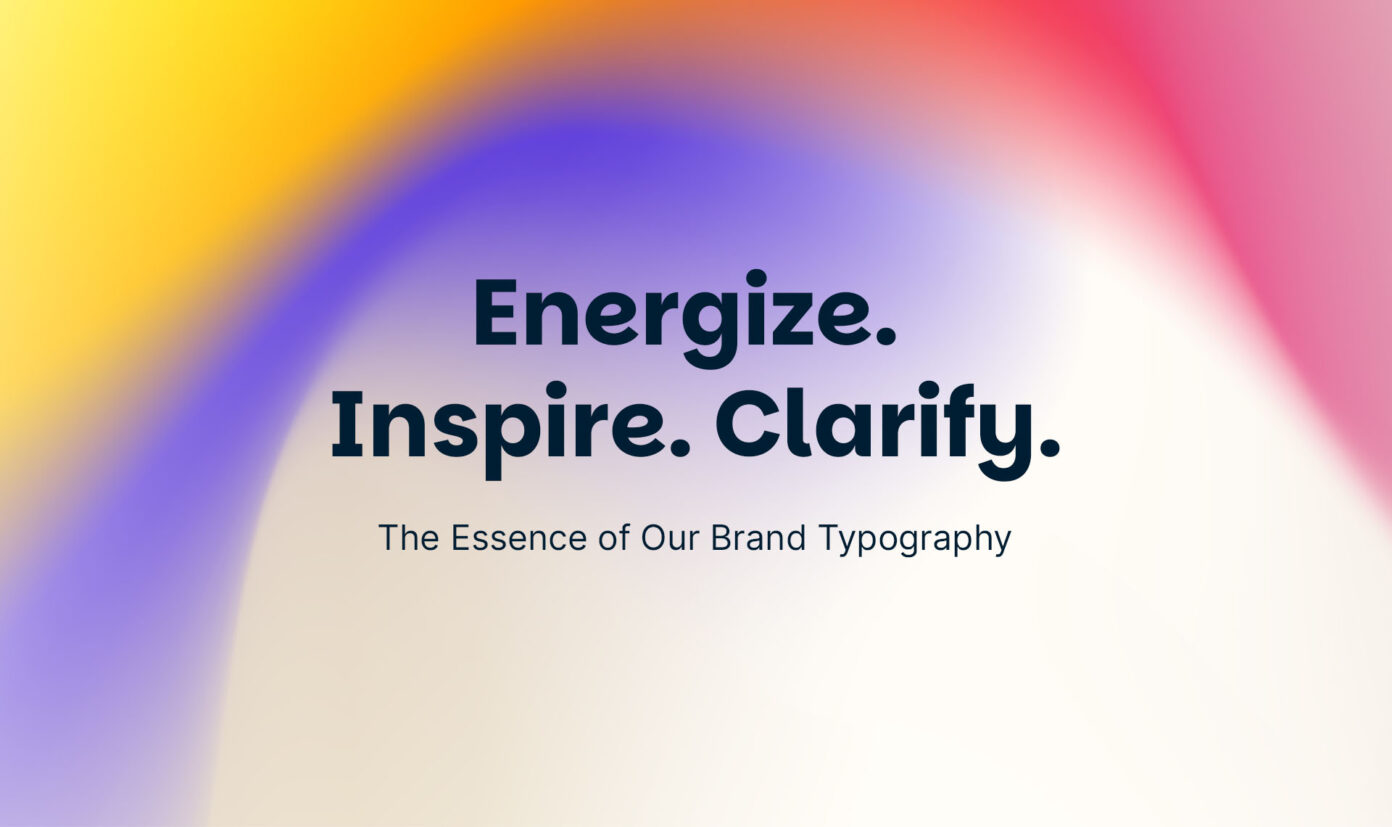
Typography is one of the most powerful elements of a brand’s identity. It not only makes text readable but also conveys the brand’s personality, values, and tone. We have selected two modern and versatile fonts that together create a cohesive, accessible, and memorable typographic identity.
Our primary font is Parkinsans. It is the voice of our brand – energetic, human, and approachable.
Our secondary font is Inter. It is the backbone that ensures readability and clarity in all situations.
Guiding principles
Hierarchy: A clear visual order guides the reader and makes content easy to scan.
Readability: We ensure our text is always effortless to read across all devices and materials.
Consistency: We use our fonts consistently across all channels, strengthening brand recognition.
Accessibility: We design our typography to be clear and understandable for all users.
Type on color
Remember that legibility and accessibility is key when placing type on colored backgrounds. We mainly use Oxford Blue or White text to ensure best possible legibility. It’s ok to emphasize certain words in a sentence for added interest, but make sure to use accessible color combinations when doing so.
Motion
Direction of motion
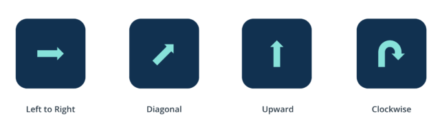
Forward movement is a way to communicate progress. We constantly use left-to-right, diagonal, upward and clockwise motion to establish sense of progress in our animations.
Easing and duration
Standard Easing Curve
The standard curve is the most common easing curve. Elements quickly accelerate and slowly decelerate between on-screen locations.
| Standard easing | |
|---|---|
| Cubic-Bezier | 0.40, 0.00, 0.20, 1.00 |
| After Effects | Incoming velocity: 80%, Outgoing velocity: 40% |
Subtle Easing Curve
Used on subtle movement on static animations. For example button hinting user to take action.
| Subtle Easing Curve | |
|---|---|
| Cubic-Bezier | 0.40, 0.00, 0.50, 1.00 |
| After Effects | Incoming velocity: 50%, Outgoing velocity: 40% |
Entrance and Exit Curves
Entrance curves are used to bring elements into view. Exit curve defines how it leaves the view.
| Entrance | |
|---|---|
| Cubic-Bezier | 0.00, 0.00, 0.10, 1.00 |
| After Effects | Incoming velocity: 90%, Outgoing velocity: 0% |
| Exit | |
| Cubic-Bezier | 0.40, 0.00, 0.50, 1.00 |
| After Effects | Incoming velocity: 50%, Outgoing velocity: 40% |
Text Animation
Our normal style of text animation consists of a small upward movement combined with animating the transparency of the text. Short amounts of text (1-2 lines) should be animated by word. Longer text (over 3 lines) is animated by lines. Depending on the amount of text material to be animated, it may be necessary to adjust the duration of the animation.
Short text (max 2 lines) is animated by words. Duration is 600ms (15 frames in 25fps).
Longer text (over 3 lines) is animated by lines. Duration is 600ms (15 frames in 25fps). Duration may need to be adjusted for larger amount of text.
Video
On-screen graphics
On-screen graphics should be minimal and clean, so the focus remains on the matter of the video. Use titles, inlays, and lower thirds to enhance the story. Graphics may enter and exit the frame based on defined motion patterns or with hard cut.
Titles
Use clean text over b-roll footage or brand background to accurately reflect the subject matter based on video type. Please note that not all videos require a title card.
End cards
We use the pre-made Visma Sign lockup in our video end card. This is a fixed element with flexible variants for specific use cases. The location of the optional message line is fixed, but the message text is flexible.
Lower Thirds
Lower thirds are used to identify person displayed on video and their profession. Use Mona Sans Expanded Semibold for name line and Mona Sans Regular for description line.